How Mobile is your Website?

Central to a company’s online presence is their website.
No longer is the web primarily a place accessed by users on desktop or laptop computers. Now, the majority of web use is via smartphones and mobile devices such as iPads and tablets. This significant shift to smaller, portable and always on-demand web access is forcing a shift in website design. No longer is it sufficient to have a website built to be viewed properly only on a desktop or notebook computers. Today the need is for sites that are built in such a way that they can be viewed according to the device a visitor is accessing the site with.
Do you need a mobile website? Check your analytics for visitor type, depending upon your industry, mobile traffic to your site can account for 35-65% or higher of all traffic!
With the massive ongoing growth of mobile Internet users, businesses need to have at least one of these two solutions:
1. Mobile Site
A mobile site solution or a responsive website. A mobile site is an alternative, unique website that is displayed to the user when it is detected they are using a mobile device. Often this is at a sub-domain such as m.yourdomain.com.
2. Responsive Website
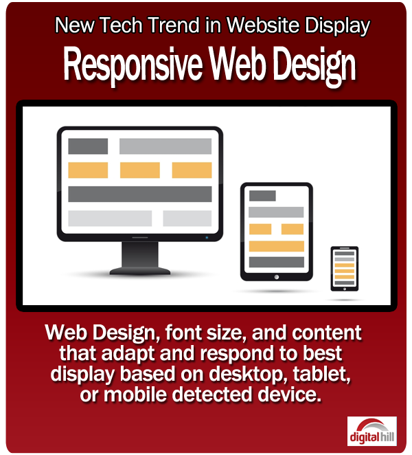
The other option is a “responsive site” where the behind-the-scenes programming adapts the site display according to the browser of the visitor. So if the visitor is found to be on a mobile, they see a mobile friendly view of the site, if on a tablet, a site maximized for the tablet screen, and the same for a full site.
The style of design is called Responsive web design, simply put because it responds to the type of device a visitor is using and delivers a view accordingly. It is not two or more different websites such as a standard site and mobile site. Responsive websites change their graphic design, web layout, presentation of content and overall appearance depending on the screen size on which it is displayed. Responsive websites can be configured to automatically adjust text size for mobile devices and also for tablets, to simplify navigation, or to change the layout and design so that zooming in and scrolling aren’t necessary. More advanced customization of responsive design can include hiding completely or tailoring text to present different information, changing photos, graphics and colors to better fit a smaller screen and to eliminate click-only features that are necessary for desktop users.
Companies today need to be thinking about how they can deliver a helpful web experience to all website visitors, whether the visitor is using a desktop, tablet, or mobile phone. The key is offering the visitor the best possible experience however it is they come to the site. If a user arrives to your site and is not easily able to read content or navigate, studies show they leave abruptly, and in business this means a lost opportunity.
Maximize the opportunities by implementing a site strategy that works well for different devices. It’s simply good business, both for marketing and sales.
With the massive growth of both tablets and smartphone use, it’s important to consider new digital technologies like Mobile and Responsive web design to ensure that all users have a friction-less experience when coming to a company’s website.