Principles of Web Design for Business Success

As more people get into web design for business, the line between web design for business success and cookie cutter web design blurs. BEWARE, the fact that a recent high school grad says they can build websites does not mean they should be putting together your business’s primary and first impression point on the web!
A web design firm for your business should be professional, and able to articulate how they are forming a comprehensive plan for your site that relies on foundational website design principles when developing a new website (or a redesign in some cases).
I’ll outline those foundational keys you should be hearing about when talking with your web design firm. Here’s my straightforward list to use when undertaking a new website project:
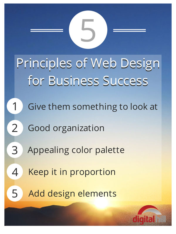
Give them something to look at! (Draw them in)
Some might feel like this is a gimme. But not all websites are created equal, and clearly not all websites have good design. The site must be appealing to the eye and draw the user in. It should not, however, make them squint or jump back. Visuals capture attention and communicate so much more than lots of text. Take time to articulate your brand visually.

I removed the name of the company because the point is not to embarrass, but to show what should happen in a good design. In my opinion, this website is poorly designed.
Good organization
A logical and user friendly placement of the elements on the website. A good website design should lead to where the viewer should look and what action the viewer should take. With this web design, the image is not compelling and the action the website wants me to take isn’t clear … should I go to sales, or the item of the week? The call to action is confusing.
Appealing color palette
Some design use every color under the rainbow and different fonts to emphasize the points they want to stand out. But when everything on the page is fighting to stand out … then nothing stands out. In fact, when there is too much information battling for attention a viewer will tend to leave the site out of confusion, rather than focus on one point. Using a consistent color palette throughout the entire site gives your brand a strong identity, and it will show viewers where their eyes should be looking.
Keep it in proportion
Your logo needs to be large enough to stand out and leave a lasting impression on the viewer. Keep it in proportion with the other elements on the website. Consistently sized font will help with readability and create “white space” on your website. (More about white space later in the series.) Make letters large enough to read, but not so big that they distract from the images and content on your website. Design for your audience. If you have an older adult audience or an audience with disabilities look at using 508 compliant standards
Add design elements
Purposefully lead your viewers to where YOU want them to look. Add and arrow to point them in the direction you want them to look. Use a star-burst behind the truly important items. (Nothing says important like a star-burst!) Want the reader to learn more? Add a link under the text. (I did that with the 508 Compliant Standards above.) Need more emphasis? Create a pop-up that needs to be clicked on to close, or a landing page that doesn’t go away until it’s read and filled out.
This is Part I of my blog series: Principles of Web Design for Business Success. Stay tuned for Part II: Principles of Web Design for Business Success: Content Placement.
Want a website that communicates your brand? You need a design team with expertise on the front and back end. Call Digital Hill. There is a DIFFERENCE IN DESIGN! Need more information? Give me a call at 317.832.2300 or e-mail me at ryan@digitalhill.com