Why Simplicity Beats Features When Introducing Users to New Platforms

When users abandon a new app or platform, the instinct is often to wonder what feature was missing. But the real problem is usually the opposite: too much, too soon.
Andrew Chen, General Partner at Andreessen Horowitz and former head of growth at Uber, has studied this pattern extensively. His analysis of over 125 million mobile phones found that the average app loses 77% of its daily active users within three days of installation. Other UX research suggests up to 80% of users leave due to poor onboarding alone.
This is what the best product teams and onboarding software get right: showing less upfront so users actually stick around to see more. The following sections break down why that works, how a principle called progressive disclosure helps put it into practice, and what successful platforms like Slack and Canva do differently.
Why Do Users Abandon New Platforms So Quickly?
Most users show up to a new app or platform with something specific in mind: they want to send their first email campaign, create a design, or set up a project. They’re not looking for a tour of every feature the product offers.
The trouble starts when onboarding tries to do too much at once. Too many tooltips, too many setup screens, too many options before the user has done anything meaningful. The brain can only take in so much new information at a time, and when it feels like too much work, most people simply leave.
Wes Bush, author of Product-Led Growth, has worked with hundreds of SaaS companies on their onboarding flows. He found that over 30% of the required onboarding steps are unnecessary and could be removed entirely without hurting the user experience. Put another way, nearly a third of what users go through before doing anything useful doesn’t need to be there at all.
What is Progressive Disclosure and Why Does It Work?
Progressive disclosure is a design principle that’s been around since 1995, when Jakob Nielsen first introduced it. The idea is simple: show users only what they need right now, and reveal more advanced options as they become relevant.
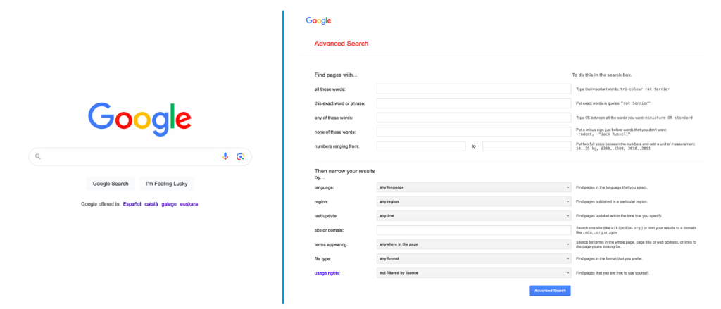
Google Search is a good example. The main interface is just a search bar—enough for most users. Advanced search options exist, but they’re tucked away for people who need them. If Google showed every filtering option upfront, the simplicity that makes it so easy to use would be gone.
A budgeting app might work the same way: start with basic spending categories, then once a user has logged a few transactions, forecasting tools will appear. A project management tool might focus entirely on helping someone create their first task before ever mentioning automations or integrations. The complexity is still there, but it’s layered in over time rather than dumped on the user all at once.
This approach mirrors how people naturally learn. Educational psychologists call it “scaffolding,” where support structures help learners move from novice to proficient without getting overwhelmed.
Research from Nielsen Norman Group found that progressive disclosure improves learnability, efficiency, and error rate. Users understand a system better when they can focus on core features first rather than scanning through dozens of options they don’t yet need.
How Do Successful Apps Onboard Users Without Overwhelming Them?
A few well-known platforms have figured out how to do this well.
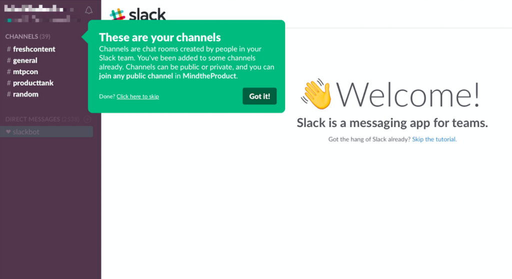
Slack uses its own Slackbot to walk new users through the interface. Rather than showing a feature tour of every menu and option, Slackbot prompts users to send their first message. Features like Threads and Activity get introduced through empty states, with helpful microcopy explaining how they’ll work once the user is active. Each iteration of Slack’s onboarding has trimmed more introductions and moved users to value faster.
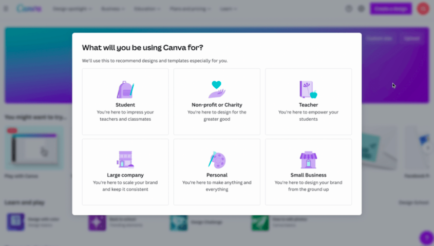
Canva asks one simple question at signup: “What will you be using Canva for?” Based on the answer, the platform tailors the experience to that use case. For example, a student will see different templates than a small business owner. This removes distractions and guides users straight to their first quick win, whether that’s a social media post or a presentation. Users can start creating something useful within a minute of signing up.
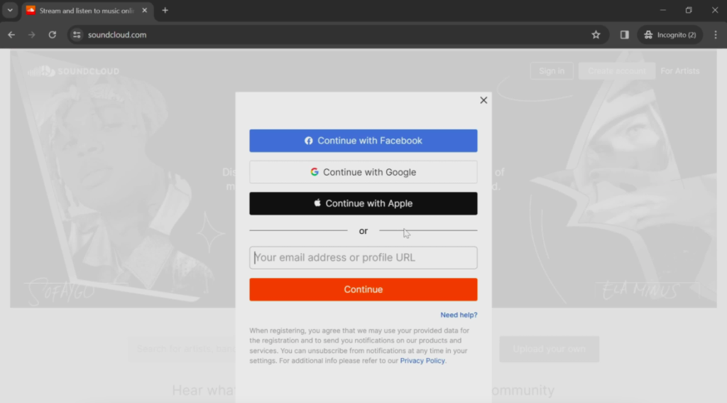
SoundCloud skips explanations entirely. The app asks for minimal information during signup, then drops users directly into the main page, where they can start exploring music immediately. The interface is self-explanatory, and users reach their “aha moment” within seconds of opening the app.
The common thread across these examples is restraint. Each platform resists the urge to showcase everything and instead focuses on helping users accomplish something meaningful within the first few minutes.
How Can Product Teams Decide What to Show First?
Not all features are equally important to someone who just signed up. Some actions correlate strongly with long-term retention, and those are the ones that should take priority during onboarding.
Looking at product analytics is a good starting point. If users who complete a particular task in their first session are significantly more likely to come back the next day, that task should be front and center. The data often reveals patterns that aren’t obvious from the inside.
Talking to users helps too. Interviews and usability testing surface what new users actually need versus what product teams assume they need. There’s often a difference between the two. Card sorting exercises can help prioritize what gets shown first and what can wait.
A simple framework for deciding what stays and what gets deferred:
- Keep: Features required to deliver core value in the first session
- Defer: Advanced options, customization settings, and integrations
- Remove: Steps that don’t directly contribute to the user’s first success
Once those decisions are made, the question becomes how to implement them. Onboarding software tools like Hopscotch, Userpilot, or UserGuiding make this easier. They allow product teams to build progressive flows, segment users based on goals or behavior, and test different approaches without waiting on engineering for every change. The goal is to get users to their first meaningful outcome with as few steps as possible. Everything else can wait.
Final Thoughts
Simplicity during onboarding has a longer effect than most teams realize. It sets the tone for the entire relationship a user has with a product.
When someone’s first experience feels calm and manageable, they start to trust the product. They believe it was built with their experience in mind, not just to impress them with a feature list. That trust carries forward. It makes users more willing to explore, more forgiving when something doesn’t work perfectly, and more open to upgrading when the time comes.
Products that overwhelm users on day one often struggle to rebuild that goodwill later. The first impression sticks, but products that earn trust early tend to keep it. The features will still be there when users are ready for them. A thoughtful onboarding experience just makes sure they stick around long enough to find them.