Local Hospital Website Design for PinnacleHealthCare.net
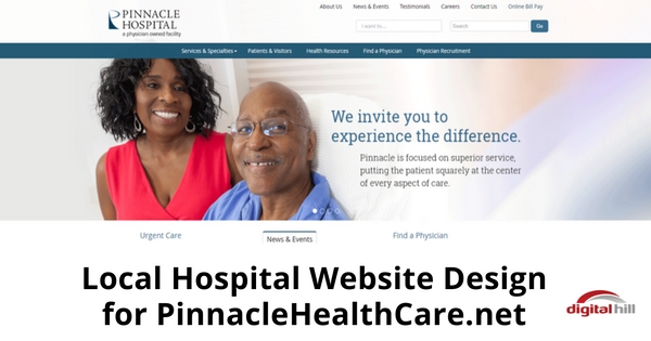
Potential customers don’t want to search around and through an unorganized website. They want to quickly and easily navigate the site to find the information they want. Our latest website design for PinnacleHealthCare.net is a clean, well laid out site; highlighting the services of Pinnacle Hospital. The new site has the following features:
- CMS (Content Management System) – Web administrators can easily alter and optimize content with our content management system.
- Clean Design – From the global navigation and utility navigation bars to the footer, the site is clear to follow.
- Mobile Responsive – During an emergency, you’re not likely to be on a desktop computer. The site is easy to see on a smartphone or tablet as it’s mobile responsiveness allows it to adjust to mobile screens.
- Physician Search API Integration – When you come to a medical site, it’s often to find a specific doctor or to search by specialty area. That’s simple on the new site with the MD Staff API integration allowing Pinnacle to easily keep current their medical team directory.
Website User Experience
Pinnacle’s new site is in line with its goal to make sure patients and visitors are comfortable from the get-go. When a visitor comes to the site for information or to make a payment, they can make their way around the site with ease.
Like a well run hospital or a clinic’s waiting room, Pinnaclehealth.net is orderly. The site is designed to be scannable with information presented in a clear, precise way. Just like a doctor’s office.
Navigation
The “About Us” and “Contact” links are right at the top. They are found quickly by users looking to know more about Pinnacle Hospital.
The link “Services and Specialties” is the first on the global navigation bar and has a drop-down menu with an arrow to indicate sub-menus. Visitors see a selection of Pinnacle’s many services.
Three main features, “Urgent Care”, “News & Events” and “Find a Physician”, are in the center of the site, drawing visitors eyes to them. While the other two are self-explanatory, the “News & Events” section provides updates to visitors, keeping the audience engaged.
Plenty of white space surrounds each section, keeping it organized. The text in these sections is keyword rich and purposefully short, avoiding clutter. Buttons styles containing clickable text are professional and easy to see.
Additional features like prominent search bars and an informational footer at the bottom of the site help users find what they need quickly. Some of the links in the secondary navigation bar are present at the footer for quick navigation.
Conclusion
Emphasizing their services, Pinnacle Hospital’s new site represents their medical services. The color scheme (blue and white) brings a unified, calm, clinical and professional look to the web page. The new website design is not just a cleaner look. It is an extension of Pinnacle Hospital’s brand and its mission to serve each person with excellence.
Digital Hill is pleased to provide Pinnacle Healthcare with a new site and the tools to keep their site updated going forward.