Mobile Use and Responsive Design: What You Need To Know
Those who follow technology can remember it was just a short time ago when businesses didn’t 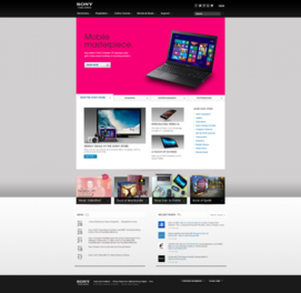 feel the need to ensure consumers the ability to view their websites on mobile devices. It wasn’t an issue, because Smartphone’s were few and far between, and more laptops were viewing their website than tablets. This is no longer the case, and the following stats might be just what you need to see to help you decide to make your website a “responsive” one.
A “responsive” website is one that changes its structure to fit optimally fit the viewing screen (see Sony’s website images in the two pictures included in this blog). Images can shrink, sections can be removed, and structure of paragraphs and other text all can be rearranged through programming of your site, to fit the screen size. The great news about this? It doesn’t affect your SEO…at all. Google indexes you’re your entire sites’ content, and if a particular section is not viewable on a Smartphone, the content is still there, and is still being counted for your Google ranking. In other words, there is NO down side to converting your website to a responsive design. If all this doesn’t convince you, take a look at the following stats (taken from mobithinking.com):
- There were 1.7 billion mobile phones sold in 2012, which was similar to the number sold in 2011.
- Strategy Analytics (January 2013): 1.575 billion handsets (cell phones) were sold in 2012, up 1.9 percent compared with 2011.
- Gartner (February 2013): predicts mobile device sales will grow to reach 1.9 billion units in 2013. Smartphone sales are expected to hit 1 billion units in 2013, which means that for the first time Smartphone’s will outsell feature phones.
- Worldwide media tablet sales to end users was 128 million units in 2012, a 78.4 percent increase from 2011 according to the IDC.
- According to Apple, 58.31 million iPads were sold in 2012
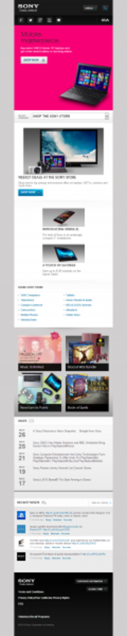
Sony’s website as viewed on a Tablet computer